The Storm Media App
Client
The Storm Media
Roles
UX strategy & design, Art direction, Visual design, Research
Clickable Prototype: https://invis.io/34KPYOHWTRM
Old Version:
The old mobile interface is only in Chinese and has wrong formatting which doesn't support all phone screens and had problems on the back-end. It is very content-focused and did not include features for personalization settings. The goal is to create a modern style interface that has a consistent front-end and back-end structure and personalization settings (personal info, coffee sponsorship, channel settings etc). This would help increase more user interaction and click-through rate.
New Version:
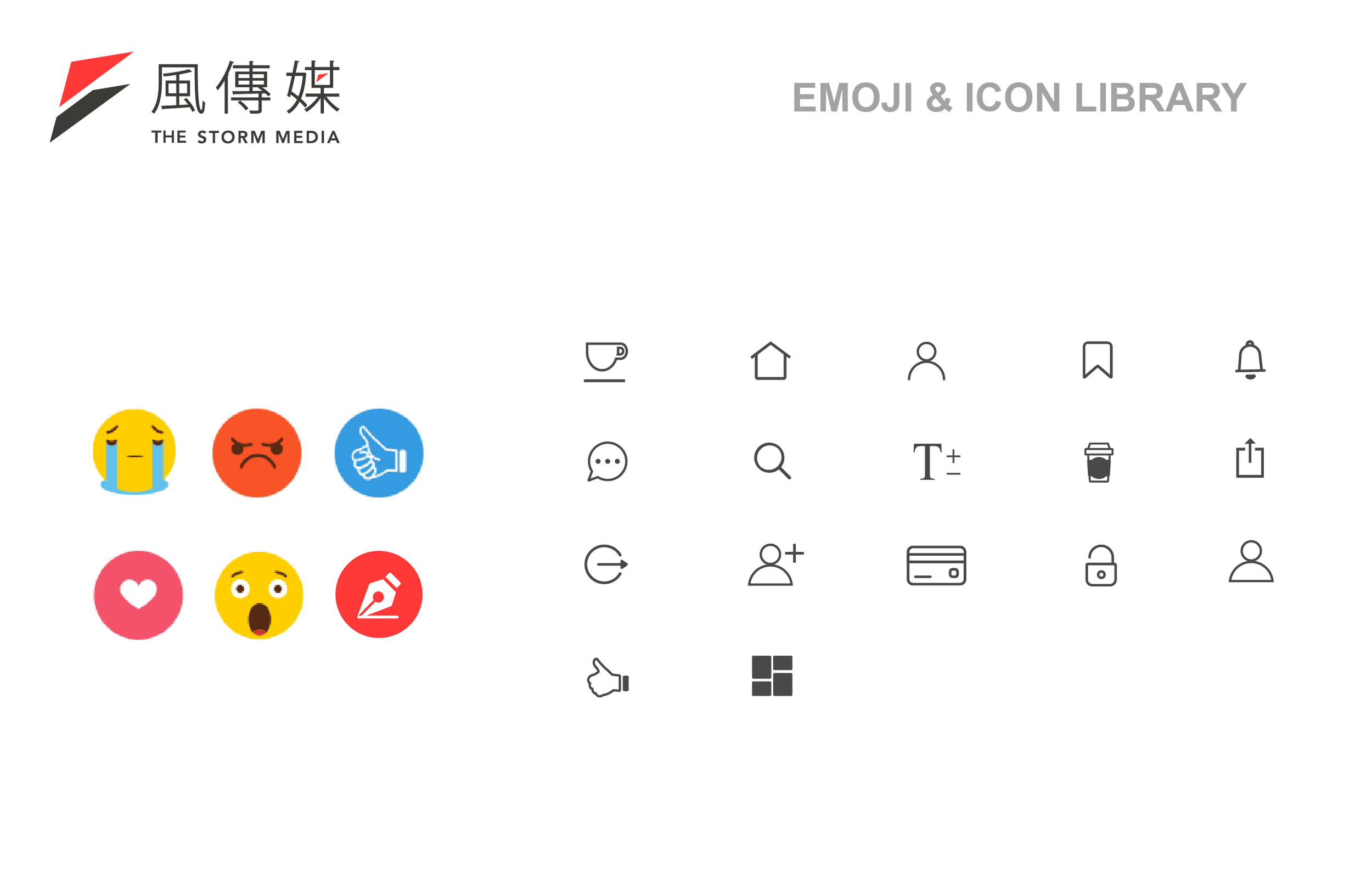
I worked with the CTO, engineers and product manager on redefining the user experience and user flow. The goal is to make it user-friendly, with the support of personalization features such as emoji user feedback, sponsorship, user settings, and channel customization etc. All these will help improve user engagement. For the user interface, a modern aesthetic is applied while following the corporate brand guideline.
I was inspired by the widget design. It gives a cleaner look and easier to navigate. Especially for a news media company, there’s always a lot of news post and might become overwhelming when you scroll through the page. Applying this concept will help solve this issue.
Result:
The team gathered the News team and E-commerce team for user testing on the prototype. The payment section was the major concern to be addressed due to security issues. The initial idea is to provide convenience for the user to perform sponsorship, and the E-commerce team thought about to include the online store section in the future. This section is still on debate.
Redesign Version


